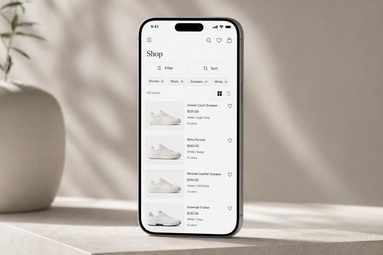
Mobile filtering is not a smaller version of a desktop sidebar. It is a focused decision-making flow that helps people reduce a long list to useful options without losing their place, their selections, or their patience. Reviewing real filter ui examples can reveal how different apps balance quick controls with deeper refinement.
A strong filter-and-sort experience makes the next action obvious. Users should be able to narrow results, understand what changed, revise a choice, and return to browsing with minimal effort. When those basics are missing, even a well-organized catalog can feel difficult to use on a phone.
Why Mobile Filter Flows Feel Hard
Phones provide limited space for controls, context, and results simultaneously. A user may open a panel, make several selections, then forget which products they were comparing. Small touch targets, vague labels, hidden active states, and abrupt page refreshes make that friction worse.
The goal is not to expose every possible attribute. It helps users make a few decisions to remove the most irrelevant results. A mobile layout should therefore prioritize clear groups, comfortable taps, and visible recovery options instead of shrinking a desktop filter sidebar into a narrow drawer.
Separate Filtering From Sorting
Filtering and sorting work together, but they answer different questions. Filtering removes items that do not meet a need, such as showing only available hotel rooms within a certain price range, and sorting changes the order of the remaining items, such as placing the lowest price or highest rating first.
Keep the actions distinct even when they share a compact bar. A button labeled “Filter” should open a set of options that narrow the list. A button labeled “Sort” should offer ordering choices. Combining both in one unclear menu forces users to pause and interpret the interface before they can act.
Start With Real User Decisions
Useful filters come from user behavior, not from a database schema. Review site search terms, customer questions, sales patterns, product comparisons, and usability sessions to identify the decisions people make repeatedly. A travel app may prioritize dates, location, price, and amenities. A recipe app may prioritize dietary needs, cooking time, and ingredients.
Ask which choices remove unwanted results fastest, which labels users already understand, and which options are rarely selected. Different categories often need different filter sets. For example, shoppers browsing laptops may care about screen size and memory, while shoppers browsing shoes may care more about size, fit, and color.
Choose The Right Mobile Pattern
Bottom Sheet
A bottom sheet works well for a moderate number of options. It keeps users visually close to the results page and is useful for common controls such as availability, price, rating, or category.
Full-Screen Panel
A full-screen panel gives complex filters room to breathe. Use it when people need to navigate multiple groups, choose ranges, or make dependent selections. It also provides more space for a persistent apply button and a clear reset action.
Sticky Bar And Filter Chips
A sticky Filter and Sort bar helps users refine results as they scroll. Removable chips above the list can show active choices, while horizontal chips are best reserved for a small number of high-priority shortcuts. Do not force complex multi-step filtering into a chip row.
In practice, use a bottom sheet for medium complexity, a full-screen panel for layered choices, a sticky bar for frequent adjustments, and chips for quick access to popular options.
Make Selections Clear And Reversible
People should never have to reopen the filter panel just to remember what is active. Show selected filters near the results as labeled, removable chips, or a concise summary. Include the active filter count, a one-tap removal option for each choice, and a prominent “Clear all” control.
Mobile research on clear filtering interfaces reinforces the value of visible selections, category-specific labels, result counts, and a deliberate action such as “Show 24 results.” That action reassures users that they can review choices before the list changes.
When no items match, avoid an empty state with no guidance. Explain the issue clearly and suggest useful recovery options, such as moving a restrictive filter, expanding the price range, or viewing similar results.
Improve Speed And Feedback
Fast feedback is part of the design. If a request takes time, show a concise loading state instead of a blank list. Preserve the current scroll position when possible, prevent duplicate requests during rapid tapping, and keep selected filters intact when a person opens an item and returns to the results.
- Update the expected result count before users apply changes.
- Use loading indicators that do not erase the user’s context.
- Save selections during navigation, refreshes, and recoverable errors.
- Offer a retry action when a request fails.
A message such as “24 results found” is more useful than a sudden shift in content. Clear feedback helps users understand both the system response and their next available action.
Build For Accessibility
Accessible filtering benefits everyone, especially when users are moving quickly or using a small screen. Give icons text labels, provide visible focus states, maintain strong contrast, and do not rely on color alone to show selection. A checked box, a selected label, or a descriptive status should clearly communicate the state.
Support keyboard navigation in web experiences, move focus logically when drawers open and close, and announce meaningful result updates to screen readers. Touch targets should be large enough for reliable tapping, while expandable groups should clearly communicate whether they are open or closed.
Test The Complete Flow
Testing should cover the entire journey, not only the moment a panel opens. Watch users select a single filter, combine multiple values, change the sorting, remove a chip, clear all choices, encounter zero results, open an item, and return to the filtered list.
Track filter completion rate, time to a useful result, zero-result frequency, reset rate, refinement rate, and task completion after filtering. Live sessions often expose small but costly issues, including unclear close buttons, lost selections, and controls that are difficult to tap with one hand.
Common Questions
Should Filters Apply Automatically On Mobile?
Automatic updates can work for simple, fast choices. For larger sets, an apply action gives users more control and prevents disruptive list changes during selection.
How Many Filters Should Appear First?
Show the decisions that matter most for the current category. Place secondary options in collapsible groups or progressive disclosure rather than presenting every attribute immediately.
Should Sort And Filter Share One Button?
They can sit in the same bar, but each needs a separate, clearly labeled control. Narrowing results and reordering results are different tasks.
Conclusion
Effective mobile filtering depends on clear priorities, visible selections, responsive feedback, and easy recovery. When users can quickly narrow choices, see what is active, undo mistakes, and return to stable results, filter and sort controls become quiet helpers rather than obstacles.