Key Takeaways
- Reception signage can orient visitors before they need to ask for help.
- Effective office signs combine clear information, accessible design, and visual consistency.
- Wayfinding should guide guests before they reach a decision point.
- Permanent room identification signs may need to meet ADA requirements for tactile characters, Braille, contrast, and placement.
- Outdoor and building-mounted signs in Austin may require review before fabrication or installation.
In Austin, Texas, a visitor may arrive after navigating a busy corridor, a multi-level parking garage, or an unfamiliar office complex. The experience should become easier at the front door, not more confusing. A clear reception sign, useful directional markers, and consistent room labels help a workplace feel prepared, professional, and considerate.
For businesses coordinating those elements, office reception signage Austin services from Hightech Signs provide an informative example of how lobby branding can connect with interior graphics, dimensional lettering, ADA signage, and wayfinding. Hightech Signs is an Austin-based commercial signage provider whose website covers custom lobby, accessibility, and navigation solutions for offices and other commercial spaces in Austin and the surrounding Central Texas area.
Why the Reception Area Sets the Tone
Visitors form an impression quickly when they enter an office. A blank wall behind the reception desk, an outdated suite label, or a cluster of handwritten instructions can make a guest wonder whether they are in the right place. In contrast, a well-planned entry answers three simple questions: Where am I? Who belongs here? What should I do next?
Consider a first-time client arriving at a downtown Austin law office. They should be able to recognize the firm, see where to check in, and locate the waiting area without having to search for clues. The goal is not to fill every wall with graphics. It is to give people the information they need at the moment they need it.
Start With the Visitor Journey
Before choosing finishes, fonts, or lighting, walk the route a new guest will take. Start outside the property and continue through the office to the meeting room. At each pause, turn, elevator bank, or corridor intersection, ask what a visitor needs to know. Good signage solves small uncertainties before they become questions for reception staff.
- Locate the correct building, entrance, or suite.
- Find the reception desk or check-in point.
- Identify the host, department, or tenant.
- Follow directions to a conference room, restroom, elevator, or waiting area.
- Leave through the appropriate exit without backtracking.
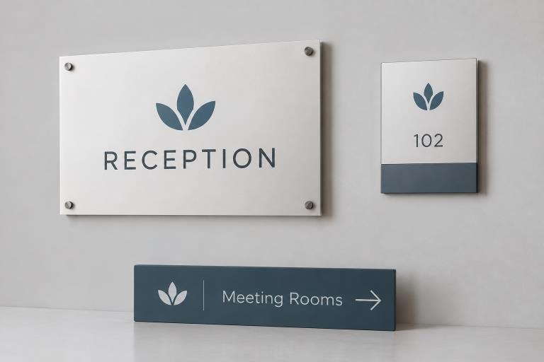
One sign rarely performs every job. A reception sign establishes identity, while a room plaque identifies a destination, and a directional sign explains how to reach it. Separating these functions keeps each message short and easier to understand.
- Reception signs display the company name or logo at the main welcome point.
- Room signs identify conference rooms, offices, restrooms, and shared spaces.
- Wayfinding signs direct people to elevators, exits, departments, and suites.
- Directory signs help guests find tenants in multi-occupant properties.
- Temporary signs communicate changes during events, renovations, or relocations.
- Safety and accessibility signs identify required routes, exits, and accessible features.
Balance Branding With Readability
A polished sign can still fail if visitors cannot read it from the entrance. Consider viewing distance, letter size, contrast, spacing, glare, ambient light, and the logo’s visual complexity. Brand colors and distinctive materials can strengthen recognition, but they should not compete with the message.
Dimensional letters may add depth to a reception wall, brushed metal can support a refined corporate setting, and acrylic can suit a clean contemporary interior. Wood or wood-look finishes can add warmth to a wellness practice or creative studio. Whatever the material, review a full-size or scaled mockup at the same distance a visitor will view it.
Plan for Accessibility From the Start
Accessibility works best when it is part of the initial plan rather than a late correction. The federal ADA design standards include requirements for signs that identify permanent rooms and spaces. Depending on the sign and location, tactile characters, Braille, contrast, non-glare surfaces, and compliant mounting locations may be relevant.
- Identify permanent rooms that need consistent, accessible labels.
- Use a readable contrast between text and background.
- Avoid glossy finishes where reflections may obscure information.
- Protect clear paths near doors, corridors, and accessible routes.
- Have complex projects reviewed by a qualified accessibility or signage professional.
Consider Austin Building and Sign Rules
Interior reception signs and exterior signage do not always follow the same approval path. For an exterior wall sign, monument sign, projecting sign, or other outdoor display, confirm property and landlord requirements before production. The City of Austin notes that outdoor signs are subject to its sign permit process and regulations under Chapter 25-10 of the Land Development Code.
Check whether the proposed installation is interior or exterior, whether the landlord controls tenant signage, and whether the property has zoning, historic, or site-specific limitations. Allow time for design adjustments if an approval process applies. This early review can prevent a finished sign from being unsuitable for the property.
Use Wayfinding to Reduce Visitor Friction
Wayfinding does not have to make an Austin office feel clinical or over-labeled. A small, consistently designed system can guide guests while preserving an inviting environment. Place instructions before the point where a person must choose a direction. For example, a conference-room arrow belongs before the hallway split, not after it.
Use the same arrow style, room names, colors, and floor terminology throughout the space. Avoid calling one destination “Level Three” on a directory and “Third Floor” on a corridor sign unless the relationship is made clear. Then test the system with someone who has never visited the office.
A Simple Office Signage Planning Checklist
- Walk the property from the visitor’s perspective.
- List every point where direction or confirmation is needed.
- Separate brand signage from safety and accessibility requirements.
- Measure wall space, sightlines, lighting, and viewing distance.
- Standardize fonts, colors, arrows, symbols, and destination names.
- Confirm ADA needs, landlord rules, and local approvals.
- Review final artwork and installation locations before fabrication.
- Walk the finished route and correct any remaining points of confusion.
Questions Office Managers Often Ask
Should a reception sign include a tagline?
It can, provided the tagline is brief and legible. The company name or logo should remain the primary visual focus.
How large should a lobby sign be?
Its size should reflect wall dimensions, viewing distance, logo shape, lighting, and available negative space. Bigger is not automatically clearer.
When should office signs be updated?
Review signage after a move, renovation, rebrand, tenant change, or shift in how rooms are used. Planning for changeable information can make future updates simpler.
Make the First Visit Feel Easy
Office signage does more than decorate a wall. It supports confident arrivals, reinforces brand recognition, improves accessibility, and helps people move through the workplace with less effort. When Austin offices treat signage as part of the complete visitor journey, the first visit can feel clear, calm, and welcoming from the entrance to the exit.