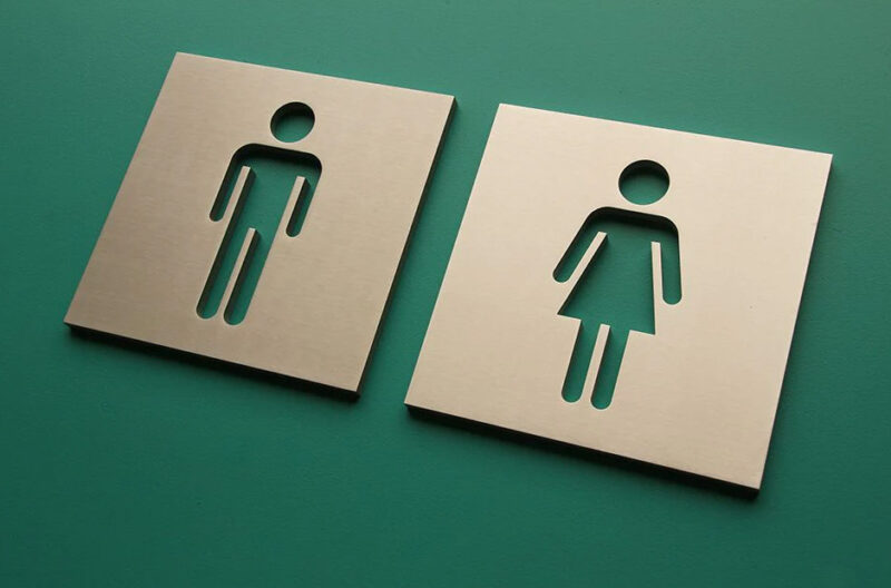
Clear restroom signage plays a key role in public comfort. People rely on quick visual cues when searching for facilities in busy interiors. Color and text choices shape how fast that information registers.
The womens restroom sign must communicate purpose with ease and respect. Design elements guide users without demanding extra attention. Careful selection of hues and lettering supports clarity in every setting.
Color Contrast That Strengthens Immediate Recognition
Strong contrast between background and text improves visibility from a distance. Light lettering on dark surfaces or dark text on pale panels works well. This difference helps the message stand out in crowded corridors.
Muted tones can reduce legibility under low light. Bold, clean contrasts support quick understanding during busy periods. Eyes locate the sign faster, which shortens search time.
Balance Between Softness and Visibility
Design teams sometimes prefer gentle palettes for aesthetic harmony. Soft shades can still perform well when paired with sharp contrast. A calm look does not need to weaken clarity.
Accent borders or subtle framing can define the sign area. These elements guide attention toward the message zone. Visual balance keeps the sign refined and functional.
Text Size and Typeface That Improve Legibility
Lettering must remain readable from various distances. Larger font sizes help users identify restroom signs while walking. Clear typefaces without decorative strokes enhance recognition.
Key text guidelines include:
- Simple sans-serif fonts that reduce visual clutter.
- Adequate spacing between letters and words.
- Upper and lower case combinations for natural reading flow.
- Consistent font use across all facility signage.
- Strong color difference between text and background.
Hierarchy That Guides the Eye
Primary words like “Women” should appear as the most prominent element. Supporting symbols or secondary details stay smaller. This structure directs attention in a clear sequence.
Visual hierarchy prevents confusion between multiple text elements. Users process the main message first. Extra information supports rather than competes.
Use of Recognizable Symbols Alongside Text
Symbols support communication across language differences. A familiar female restroom icon reinforces the written label. Dual cues increase the chance of fast understanding.
Symbol placement should sit near the main word. Balanced spacing prevents visual crowding. Clear alignment keeps the sign organized.
Key symbol considerations:
- Universal shapes that match standard restroom icons.
- Adequate size for visibility from hallway distances.
- High contrast between icon and background.
- Consistent style across all restroom signage.
- Clear separation from surrounding graphics.
Cultural Sensitivity in Visual Representation
Icons should remain respectful and neutral. Overly stylized graphics may distract from the message. Simple outlines communicate purpose without confusion.
Design that respects diverse users creates inclusive environments. Clear representation avoids misinterpretation. Comfort increases when signage feels considerate.
The Lighting Conditions and Surface Finish
Restroom signs appear under many lighting conditions. Glossy finishes can reflect glare from overhead fixtures. Matte or satin surfaces reduce reflections and improve readability.
Color choices must account for these lighting factors. Shades that look clear in daylight may lose contrast in dim areas. Testing samples under actual lighting helps confirm visibility.
Consistency Across the Entire Facility
Uniform design across all restroom signs creates a reliable system. Repeating colors, fonts, and symbols builds familiarity. Familiarity speeds up recognition during future visits.
Mixed styles can cause hesitation. Clear standards support smooth wayfinding. Visitors trust signage that looks coordinated.
Thoughtful color and text decisions thus shape how easily the womens restroom sign communicates. Strong contrast, readable fonts, and clear symbols guide users with confidence. Well-planned signage turns a simple need into a smooth, stress-free experience.


